File Size: 2820KB
Total Views: 7800
Date Created:
Last Modified Date:
Official Website: Go to website
License: NOASSERTION
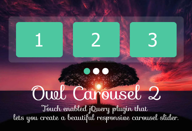
Owl Carousel 2 is a fully responsive and super customizable jQuery plugin that helps to create the most powerful touch and drag enabled carousel for modern websites. Owl Carousel has a lot of options and events and anyone can configure it easily. You can find a very basic styling of the carousel but it can be modified easily with the help of CSS as you need.
Remember that the plugin is now DEPRECATED. Check out our Slider section for more Carousel plugins.
Features:
- Supported custom animation types and speed.
- Mouse Drag, Touch Drag, Pull Drag and Free Drag.
- Infinite loop like a carousel.
- Auto Height, Auto Width and Auto Play supported.
- Can be set Various Widths for each carousel item.
- YouTube/Vimeo/vzaar support (fetching thumbnails as well)
- Supports on all modern browsers and devices.
How to use it:
1. Include the Javascript owl.carousel.min.js at the bottom of the web page.
<script src="path/to/owl.carousel.min.js"></script>2. Include the CSS owl.carousel.min.css in the header of the page.
<link rel="stylesheet" href="path/to/owl.carousel.min.css">3. Include the CSS owl.theme.default.min.css for default predefined styling for the carousel.
<link rel="stylesheet" href="path/to/owl.theme.default.min.css">4. Include the CSS animate.css if you need custom animation for the carousel.
<link rel="stylesheet" href="path/to/animate.css">5. Add the basic HTML to the page.
<div class="owl-carousel owl-theme">
    <div class="item"><h4>1</h4></div>
    <div class="item"><h4>2</h4></div>
    <div class="item"><h4>3</h4></div>
</div>
6. Initialize the plugin and we’re ready to go.
$('.owl-carousel').owlCarousel({
    loop:true,
    margin:10,
    nav:true,
    responsive:{
        0:{
            items:1
        },
        600:{
            items:3
        },
        1000:{
            items:5
        }
    }
});


