


File Size: 364KB
Total Views: 538
Date Created:
Last Modified Date:
Official Website: Go to website
License: MIT
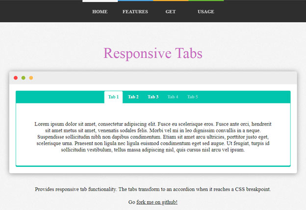
Responsive-Tabs is a very useful jQuery plugin that converts the tabs to accordion on mobile automatically through CSS breakpoint. By default, it transforms to an accordion below 768px, but you can modify this breakpoint in CSS as per your requirements.
Features:
- It can be installed with
BowerandNPM. - Lightweight and easy to implement.
- Tabs can be opened with URL hashes.
- Uses CSS for the desktop/tablet/mobile view.
- Supported on all major browsers and devices.
- Tabs can be disabled.
- Tabs can auto rotate.
Install with Bower
$ bower install responsive-tabsInstall with NPM
$ npm install responsive-tabsHow to use it:
1. Include the Javascript jquery.responsiveTabs.min.js at the bottom of the web page.
<script src="path/to/jquery.responsiveTabs.min.js"></script>2. Include the CSS responsive-tabs.css in the header of the page.
<link rel="stylesheet" href="css/responsive-tabs.css">3. Add the basic HTML to the page.
<div id="defaultTabs">
    <ul>
        <li><a href="#tab-1">Tab-1</a></li>
        <li><a href="#tab-2">Tab-2</a></li>
        <li><a href="#tab-3">Tab-3</a></li>
    </ul>

    <div id="tab-1">Tab content 1</div>
    <div id="tab-2">Tab content 2</div>
    <div id="tab-3">Tab content 3</div>
</div>
4. Initialize the plugin and we’re ready to go.
$('#defaultTabs').responsiveTabs({
    startCollapsed: 'accordion'
});
5. Include style.css for a basic tab/accordion theme
<link rel="stylesheet" href="path/to/style.css">Plugin’s default options:
| Name | Default | Description |
|---|---|---|
| Collapsible | accordion |
|
| Start collapsed | false |
|
| Disabled tabs | [] |
|
| Active tab | null |
|
| Accordion Tab HTML element | '<div></div>' |
|
| Set hash | false |
|
| Rotate | false |
|
| Event | 'click' |
|
| Animation | default |
|
| Animation Queue | false |
|
| Animation Duration | 500 |
|
| Scroll to Accordion panel | false |
|
| Scroll To Accordion On Load | true |
|
| Scroll To Accordion Offset | false |
|
| Navigation container | '' |
|
Click
This callback is called after a tab is clicked, regardless of whether it’s disabled
Arguments
- event: Clicked event
- tab: Clicked tab object
click: function(event, tab){},Activate
This callback is called after a tab is selected
Arguments
- event: Activate event
- tab: Activated tab object
activate: function(event, tab){},Deactivate
This callback is called after a tab is deactivated
Arguments
- event: Deactivate event
- tab: Deactivated tab object
deactivate: function(event, tab){},Load
This callback is called after the plugin has been loaded
Arguments
- event: Load event
- tab: First tab object
load: function(event, firstTab){},Activate State
This callback is called after the plugin switches from state (Tab view / Accordion view)
activateState: function(){}