

File Size: 7021KB
Total Views: 14717
Date Created:
Last Modified Date:
Official Website: Go to website
License: MIT
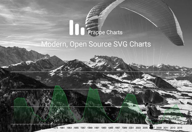
Frappe Charts is a modern and responsive SVG charts plugin that supports line, bar, axis-mixed, pie, percentage, and heatmap chart. There are various types of options and you can use them accordingly as you need.
Features:
- It can be installed with
NPMandYARN. - Multiple
datasetssupported. - Supports multiple axis and mixed axis accordingly.
- Supports line, bar, axis-mixed, pie, percentage, and heatmap chart.
- Very easy to use and customizeable.
Install with npm
$ npm install frappe-chartsHow to use it:
1. Include the Javascript frappe-charts.min.iife.js at the bottom of the web page.
<script src="path/to/frappe-charts.min.iife.js"></script>2. Include the CSS frappe-charts.min.css in the header of the page.
<link rel="stylesheet" href="path/to/frappe-charts.min.css">3. Add the basic HTML to the page.
<div id="chart"></div>4. Initialize the plugin and we’re ready to go.
const data = {
    labels: ["12am-3am", "3am-6pm", "6am-9am", "9am-12am",
        "12pm-3pm", "3pm-6pm", "6pm-9pm", "9am-12am"
    ],
    datasets: [
        {
            name: "Some Data", type: "bar",
            values: [25, 40, 30, 35, 8, 52, 17, -4]
        },
        {
            name: "Another Set", type: "line",
            values: [25, 50, -10, 15, 18, 32, 27, 14]
        }
    ]
}

const chart = new frappe.Chart("#chart", {  // or a DOM element,
    title: "My Awesome Chart",
    data: data,
    type: 'axis-mixed', // or 'bar', 'line', 'scatter', 'pie', 'percentage'
    height: 450,
    colors: ['#7cd6fd', '#743ee2']
});
Plugin’s default options:
| Name | Default | Type | Description |
|---|---|---|---|
| Container |
|
The first parameter required by the Chart constructor is the container element. You can pass in a CSS Selector or a DOM Object. |
|
| Options |
|
The second parameter required by the Chart constructor is the options object. The minimum required configuration is to pass data values, which itself requires an array of labels and an array of datasets. |
|
| data | Required Properties: labels, datasetsOptional Properties: yMarkers, yRegions |
Object | Contains an array of labels and an array of datasets, each a value for the 2-dimensional data points. |
| title | '' |
String | Add a title to the Chart. |
| type | lineValues: line | bar | axis-mixed | pie | percentage | heatmap |
String | Let the chart know what type to render. |
| colors | ['light-blue', 'blue', 'violet', 'red', 'orange', 'yellow', 'green', 'light-green', 'purple', 'magenta', 'light-grey', 'dark-grey'] |
Array | Set the colors to be used for each individual unit type, depending on the chart type. |
| height | 240 |
Number | Set the height of the chart in pixels. |
| axisOptions | {} |
Object | |
| xAxisMode and yAxisMode | Default: spanValues: span | tick |
String | Display axis points as short ticks or long spanning lines. |
| xIsSeries | 0 |
Boolean | The X axis (often the time axis) is usually continuous. That means we can reduce the redundancy of rendering every X label by setting xIsSeries to 1 and allowing only a few periodic ones. |
| TooltipOptions | {} |
Object | Customizing options for the format of the label and value displayed on hover tooltips. |
| # | {} |
function | |
| barOptions | |||
| barOptions | {} |
Object | Can be used to set various properties on bar plots. |
| spaceRatio | Default:0.5Min: 0Max: 1 |
Number | In order to set the bar width, instead of defining it and the space between the bars independently, we simply define the ratio of the space between bars to the bar width. The chart then adjusts the actual size proportional to the chart container. |
| stacked | 0 |
Boolean | Renders multiple bar datasets in a stacked configuration, rather than the default adjacent. |
| lineOptions | {} |
Object | Can be used to set various properties on line plots, turn them into Area Charts and so on. |
| isNavigable | 0 |
Boolean | Makes the chart interactive with arrow keys and highlights the current active data point. |
| valuesOverPoints | 0 |
Boolean | To display data values over bars or dots in an axis graph. |